Artist Statement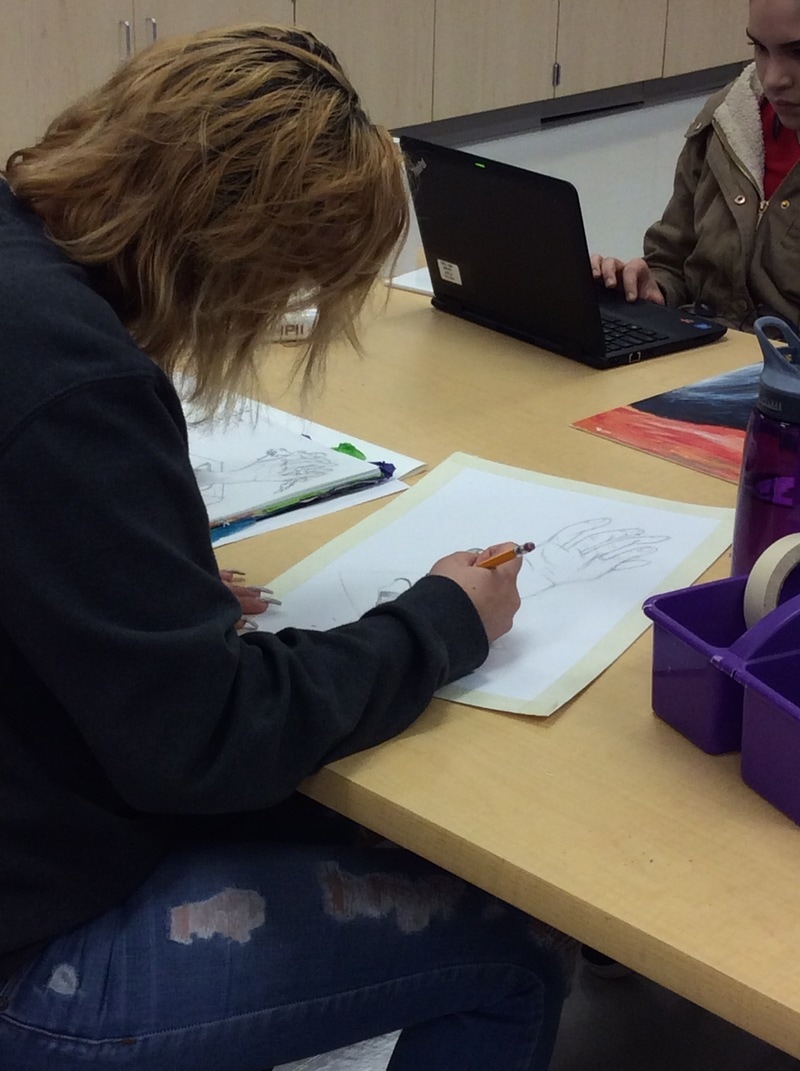 This semester was all about finding myself and having a voice for others. My artwork would be basic and simple but all had a stronger meaning from the colors I would use in my artwork. I used many materials to make different pieces but the one I absolutely enjoyed was using acrylic paint because it was free flow. I want people to think when they see my pieces. I want people to know that they're not alone. I want to break the wall of fear for those who want to have a voice. My most successful project this semester was my final piece. I wanted people to realize what was going on in the world and the way they were being lied to. It also got people thinking and it's exactly my goal. The one piece I would definitely do all over would be my very first piece. I didn't like the way the mirror was stained. I also dislike how you were unable to see the person. I feel like I was unable to connect with my audience. If I could do it again I would do my person in different color layers. Overcoming obstacles has always been a challenge for me. I have a hard time sticking to one thing once it isn't going fast or showing any progress. I really enjoy how my pig came out after hours and time put into the piece the quilling. Finally it became something I enjoyed doing and relaxing.
0 Comments
Why do it?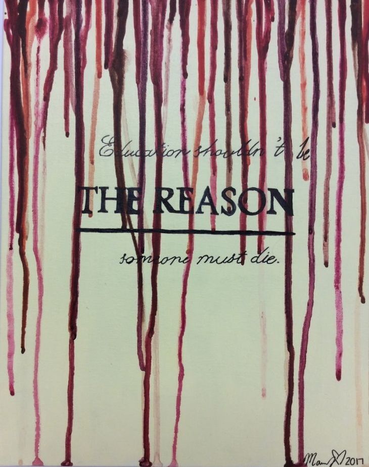 I didn't know what it would feel like to be proud of an art piece till I created this one. It took little bit of time. I used a canvas and acrylic paint and the writing with just sharpie. The title of my art piece defines what my art piece is about. Why are you doing these things to these individuals or maybe even yourself. You can definitely see the different shades of drip. They're all in the same family and represent pain. I decided to use drip because it showed blood coming down at different speeds, which can also be defined as different ages. The news inspired me to do this art piece. It came from innocent non-white children being killed randomly out in the streets for most of the time just walking home from work. The quote " Education shouldn't be THE REASON someone must die." comes from not just whats going on but what they think it's okay. Society has made their own belief that the only people that matter are those with education, those who have honor roll in school and that those are the ones that shouldn't be killed. Well, what if these people didn't have an education or have good grades? would that be a better reason for certain people to die on the daily?NO!
I wanted people to think about life. The yellow in the background defines someone inner skin tone because of what's inside and the different shades of drip should've signified blood and suffering. The words because in cursive describes education and how it may be important but the middle being bold and not cursive says it's not necessary. My goals as an artist are to express feelings people are feeling but are afraid to do so because of what may be the result after they've spoken their truth. This piece relates to a lot of people and it gives them a chance to breathe because i've taken the weight off of them about having to discuss this topic with someone and being afraid. This piece is exactly what I was expecting it to be, a reliever. Dorm LetterThis was a pretty fun route for me. It was fun just having to paint the letter with not having to worry about a different color going where I accidentally painted. My art piece is made out of cardboard only and it has brown paper wrapped around it to make it stronger. The back part of it was spray painted black but I didn't like how people were able to see the cardboard. A specific person didn't inspire me to do this piece but the thought of going to college did. I usually see in movies how college students have dorm letters to define their first name and I just wanted to do something reusable. It express being girly since it's pink with glitter. Not many girls are pinkalicious but I most certainly am. I don't have many goals as an artist but to be free and create. I may not know many things but I go for it. I'm not very satisfied with myself because I believe i stayed in a safe zone. I didn't explore much with this piece so unfortunately I didn't reach my goal. This art piece was exactly how I pictured it except without the lights but it's exactly what I can see in a dorm room.
Magazine Holder The name of my artwork is basic and obvious. It's a magazine holder. My artwork provides 3 tubes where you're able to roll your magazine and just slide it into one of the tubes. It is made from cardboard and plaster gauze. In order to get the tubes i had to tape 2 used tape rolls in order to get the shape. Then, i put vaseline all over the tape then wrapped a plastic bag over it. After that was done I wrapped it with plaster gauze about 2 - 3 times to get them thick enough to support the magazine. What inspired me to do a magazine holder was basically the fact that you don't see many of them. You usually see just shelfs or cubes. So i decided to make something fun and appealing while still making it useful. My goal as an artist is to explore various materials. This piece most definitely help me reach my goal because before the day i started this project I had no idea what plaster gauze was so that was shocking news when I found out I was using something out of the norm. I learned that your idea may seem easy but the work behind it isn't what you had imagine.
Twisted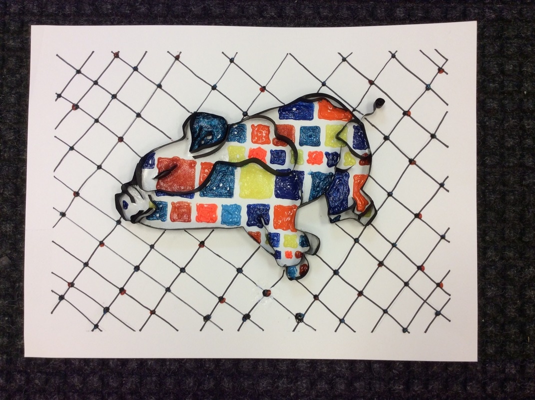 For this assignment I decided to challenge myself into trying something new. Quilling is something I constantly see on my Instagram feed and just always grabbed my attention. It isn’t an all around 3-D design but it’s definitely a pop up 3-D. The title of my work is Twisted because it defines it’s movement of the paper. Also I had to constantly twist my wrist to get the paper to look a certain way. The amount of time put into making the paper curved I believe is the most obvious element in my work. My artwork is simple. It was made from construction paper and the squares were made of puffy paint. I used a tweezers to help me make the specific sharp curves on the pig which sometime was difficult that i had to use my nails also as a tool. My artwork doesn’t come from a social or personal issue it was more of me having fun and just doing something new. My pig is asleep and has a smile meaning he is having a peaceful dream. My goal as an artist with this assignment was to finish what I started. I wasn’t sure if i was going to commit to quilling because the amount of time it took just to get a curve done or a leg but it was totally worth it. This piece taught me patience and to concentrate on things I want to accomplish. I learned that when things look easy in reality is hard and takes time but you just need patience and confident and you’ll get through it. My final piece was exactly what I had imagine it to be and I love it.
Poison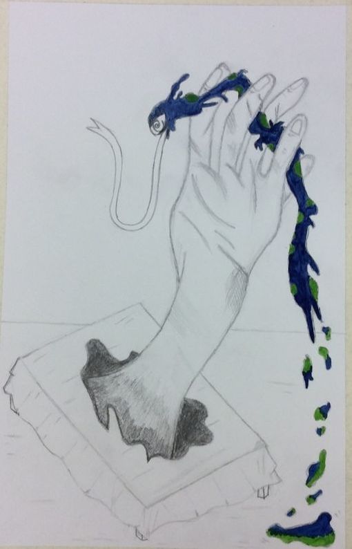 What's going on with my final piece you may ask yourself, it's a re-image of one of Distortedd art pieces. Most of her art always has a motif that is constantly repeated in all of her pieces and it's the swirl eyes. The swirl eye is her sign, also defines unclear of life and future. She has been through a lot of pain that her past has been splashed on canvas. My art piece is made from just a regular #2 orange pencil, and water color on the snake/worm. I did a lot of gesture drawing with just scribbles until I knew exactly how I wanted it to bold in the parts I wanted. This piece can have several meanings depending the person that views it but for me it means hidden strength. You would've never thought a hand could come out of a table to try to kill its enemy but it does happen, even though we don't know who wins we still know they've tried. My goal for this project was to do something i was comfortable with and that was paper and pencil. I'm afraid to go out of my comfort zone because afraid it won't look appealing. This piece is everything I could imagine. It was quick and spent all my time on it. I am very proud of the final product.
See Yourself?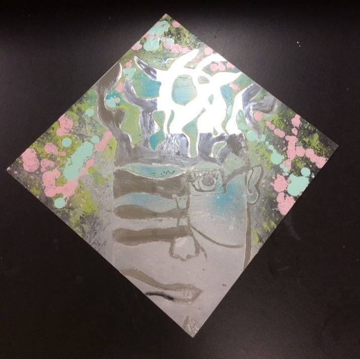 Ending with this wasn’t my idea. I spent several weeks trying to figure out what colors I want. I had several drafts with different colors put together seeing if i liked how they were put together, unfortunately the colors I kept choosing didn’t match. I notice my art was different. I knew I wanted to create something no one was doing but also with a meaning behind it. My story behind a mirror and the colors is unique. I choose a mirror and a weird looking person with the idea of others people body features was that they aren’t seeing their true self. People tend to see only what the mirror shows them but not what/who they are. The colors splattered around are blue and pink signifying both genders can deal with these problems and it can be resolved with each other. Of course, this wasn’t what I imaged my final product to look like but it’s what it turned out to be. Sometimes your idea doesn’t end the way you want it to but no artist can say his first idea was his final. Things change all the time and it’s only for the better.
|
AuthorMarjorie Sanchez Archives
May 2017
Categories |
 RSS Feed
